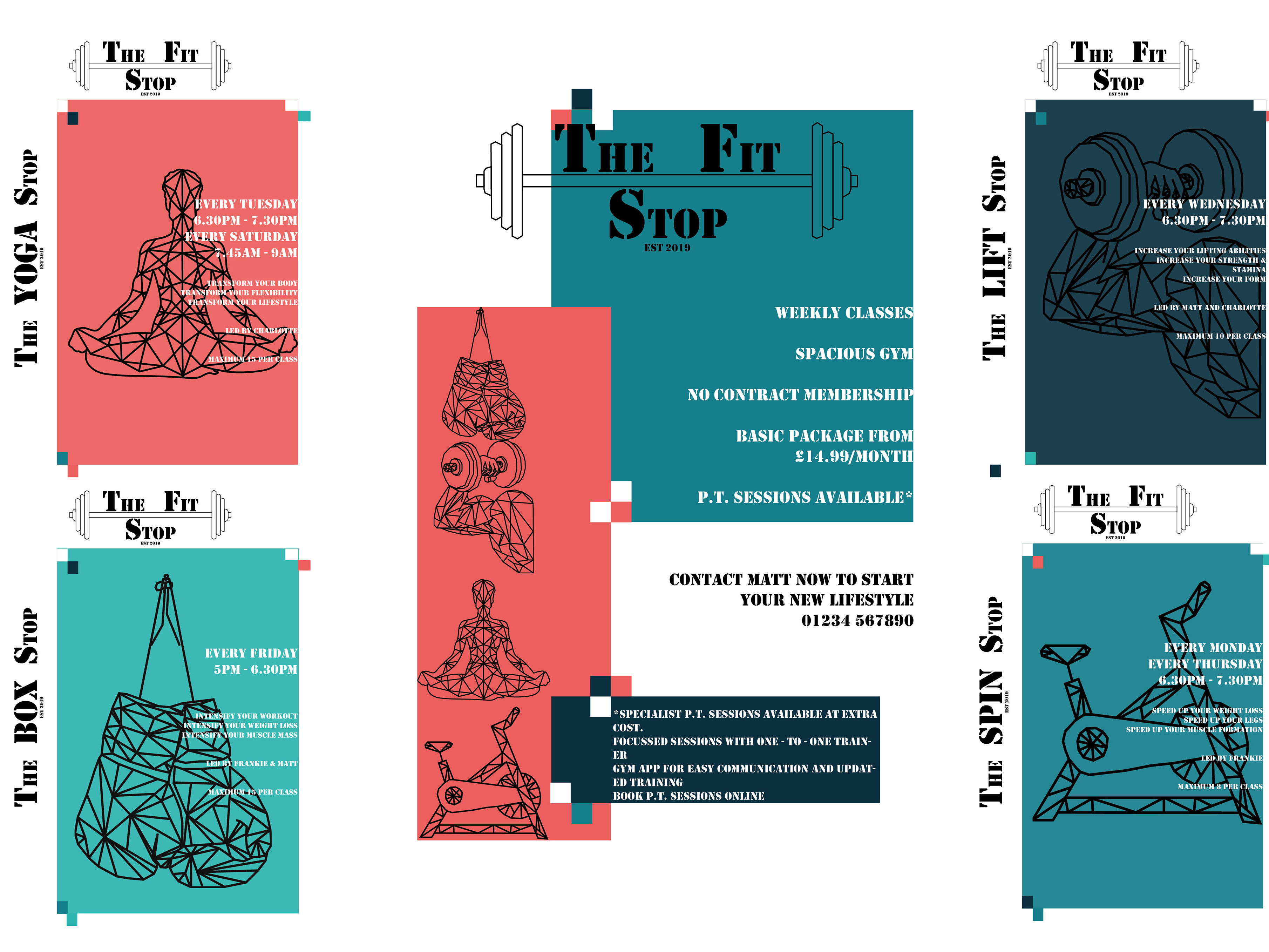
This project was a freelance design piece for a small local company needing an impactful and young design for their display.
This will be used on T-Shirts, bags, as small stickers and on cards. the company wanted a reflection of the different product they were marketing and also wanted the logo aimed at the younger market.
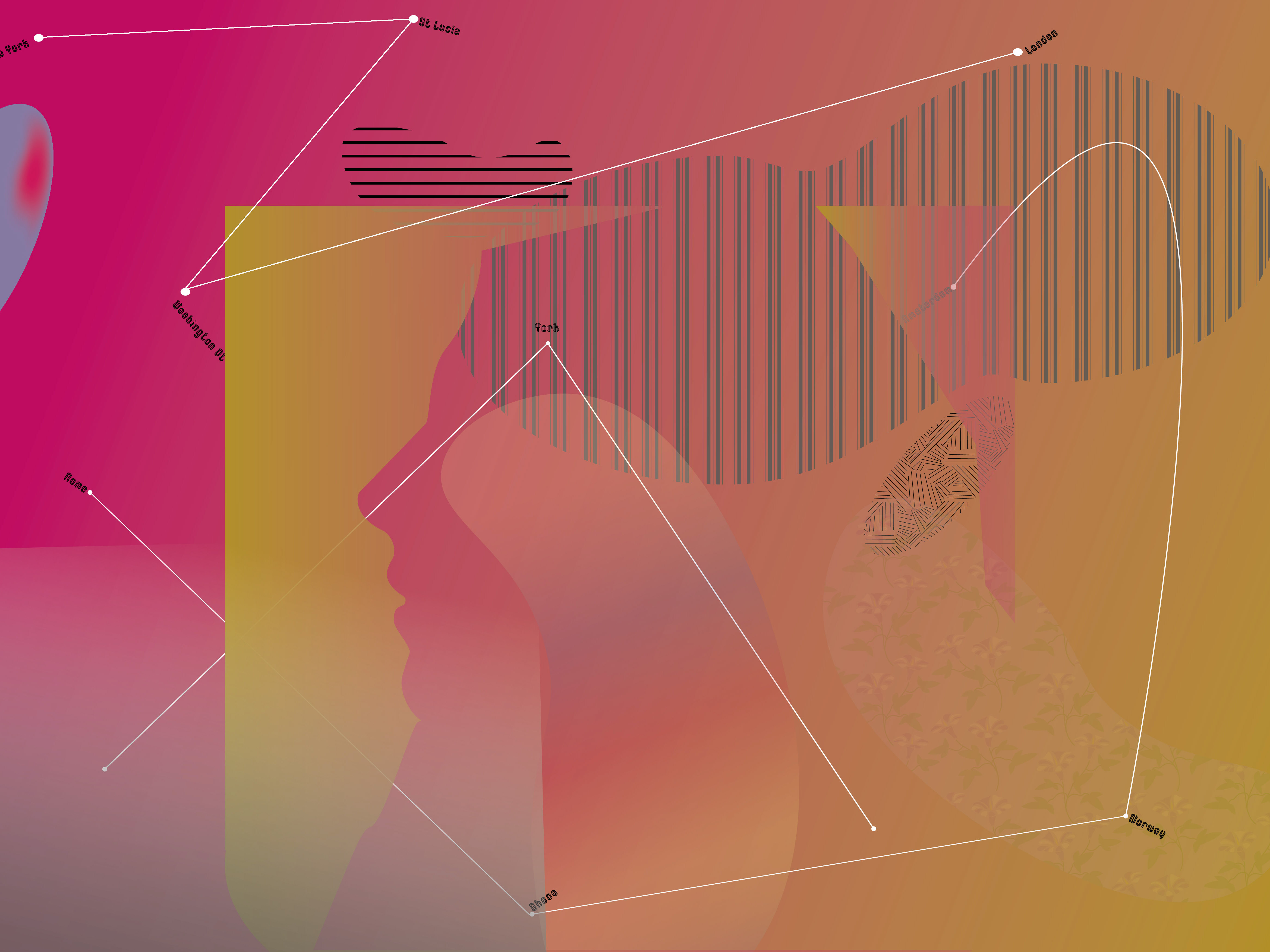
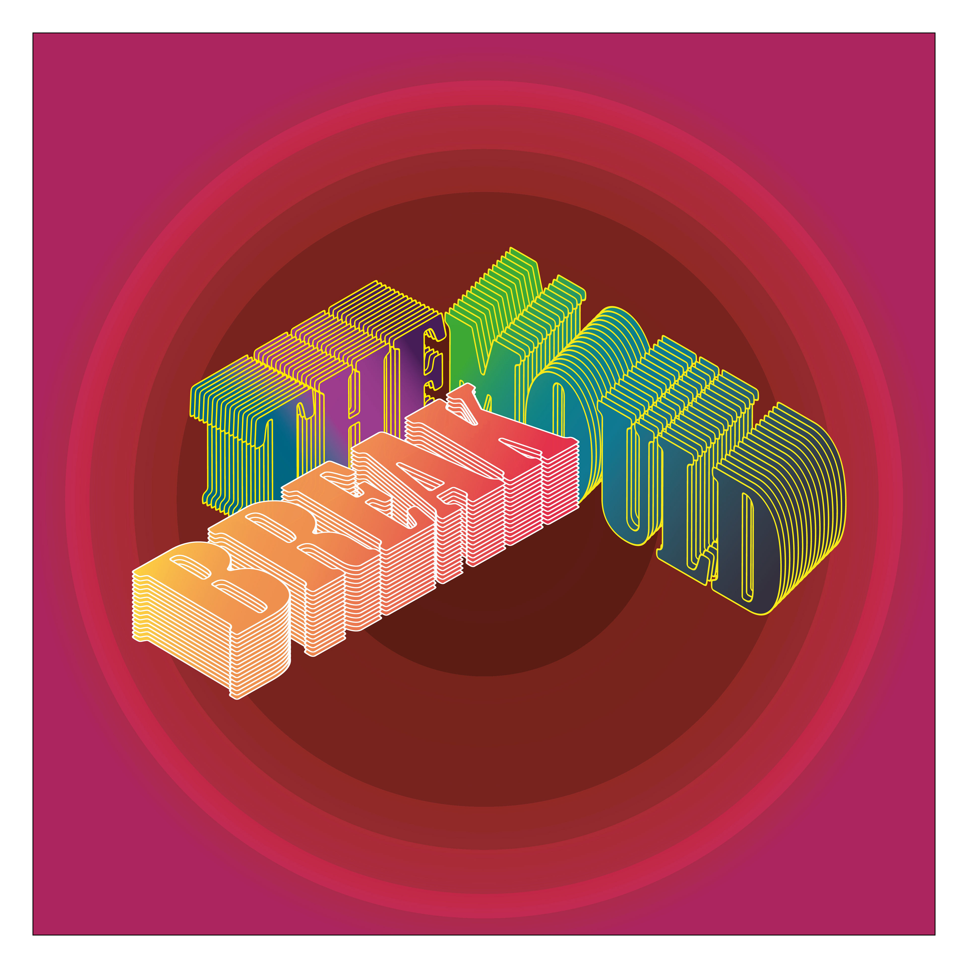
My main inspiration for this design was Kate Moross - a designer I have been following for a number of years. Her multi-layered designs and bright colours combined with powerful messages helped me create this eye-catching logo.
I chose the pinks and red colour scheme so the logo would stand out against white or black shirts or bags. I wanted to utilise my 3D skills to manipulate the wording. using this 3d design means the words blend together and are not immediately read in the correct order - i feel this adds a fun and alternative element to the design and makes the wording pop!