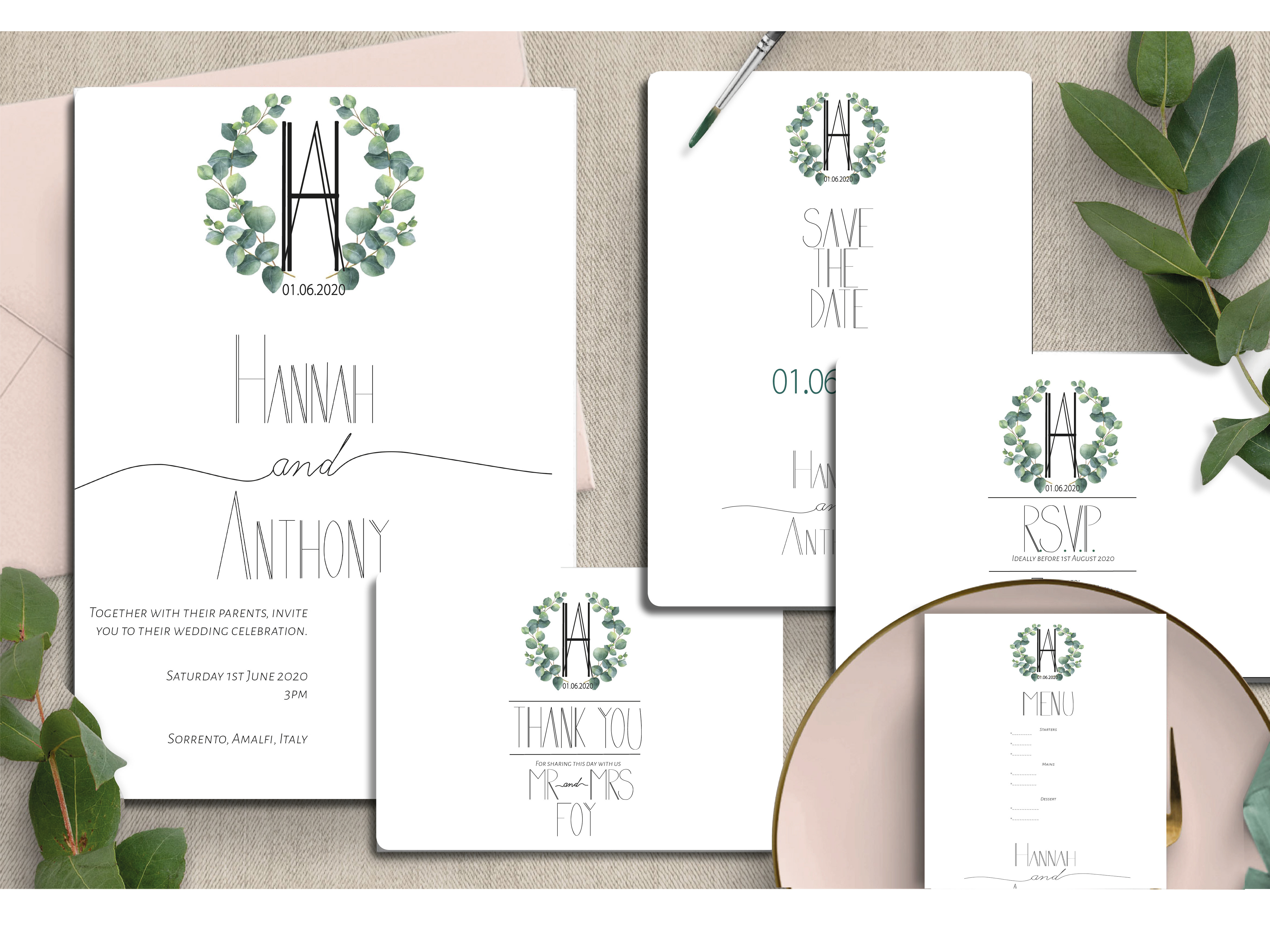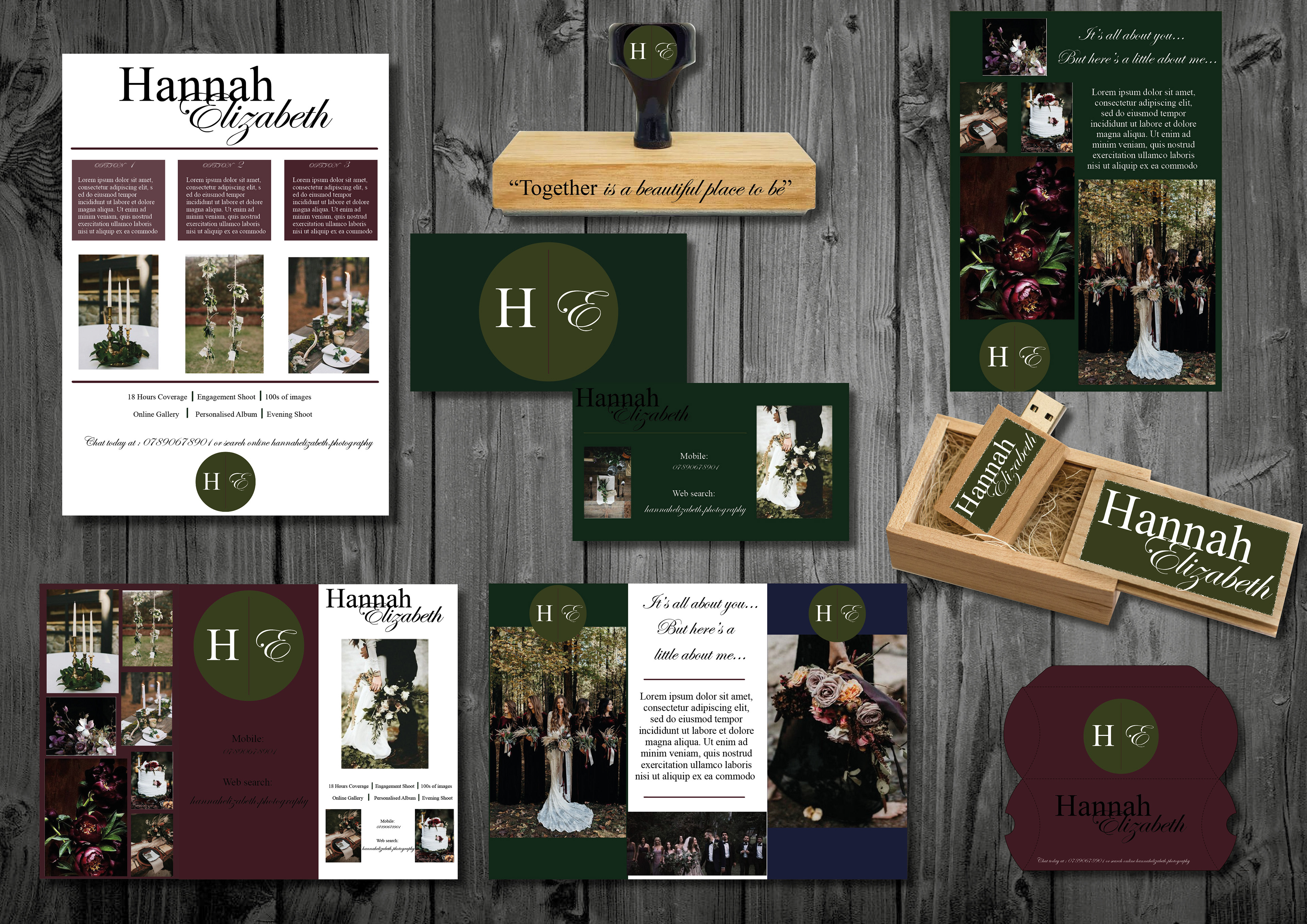
Wedding Photographer Branding Package
I loved this brief - as a budding photographer, I was able to tap in on my own resources and style to create the above package.
The brief was to create a branding package for a wedding photographer in their particular art style to represent them. Upon researching, a lot of Wedding Photographers use dreamy imagery, muted pastel colours and a lot of metallics. My own photography style is low-key - focusing on the darker shades and moody colours. Therefore I felt this was important to reflect in the design. The use of 4 main colours - burgundy, dark green, olive and navy reflected my personal preference.
I feel my main strengths in this project were predominantly related to the use of the colours in the branding - especially the main logo / emblem. For a photographer, to have a recognisable logo is vital and this can be used and recreated time and time again.
I also felt it was vital to focus on what's important - the pictures! All future brides and grooms want to see proof of the photographers ability and style - it has to work for them too.
I feel, personally, that I could have improved the USB box - for me I feel it slightly lets down this imagery of darker colours and precision. The wood is not the right shade and the design should just feature a wood carving of the logo rather than a coloured sticker for more finesse.