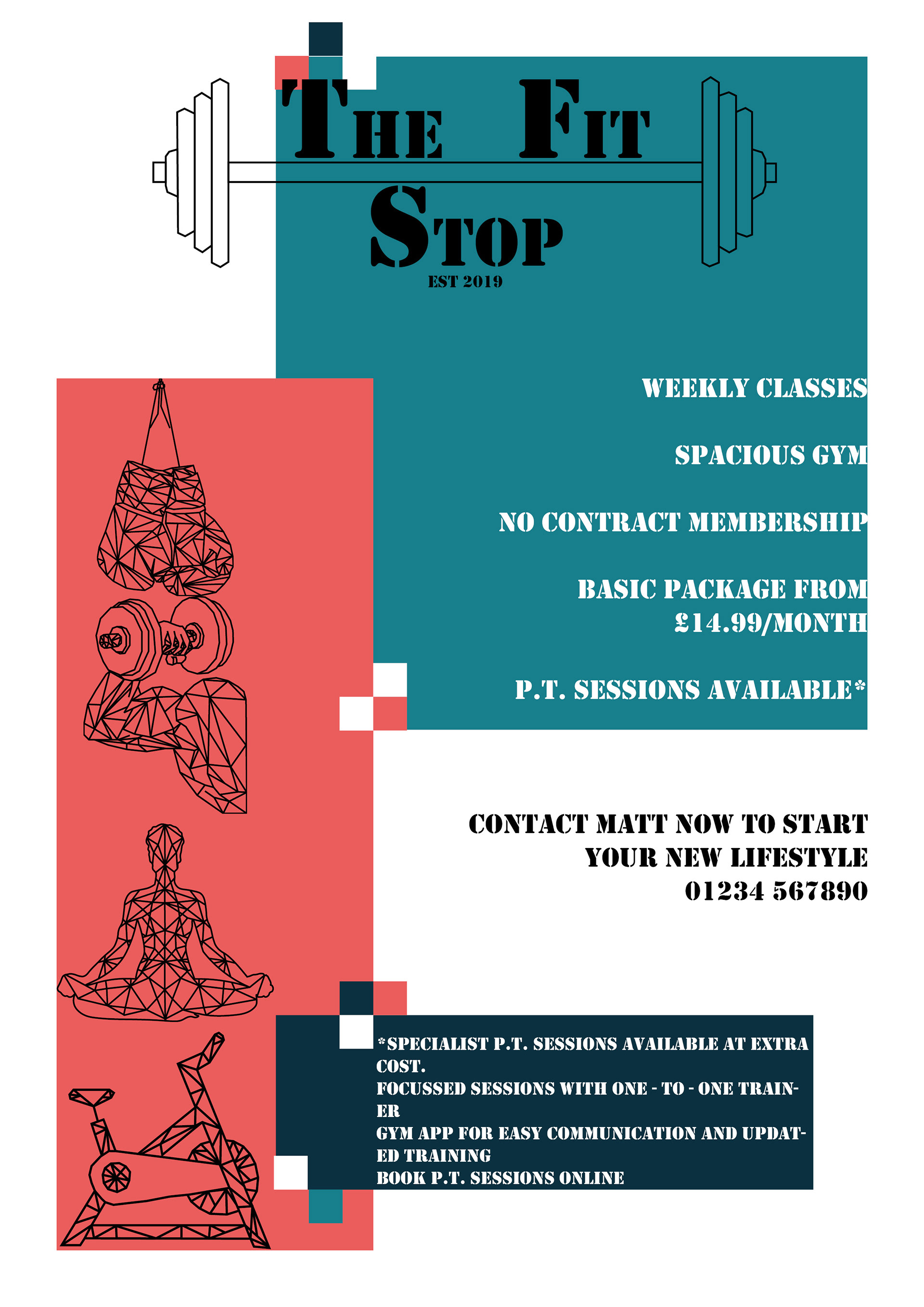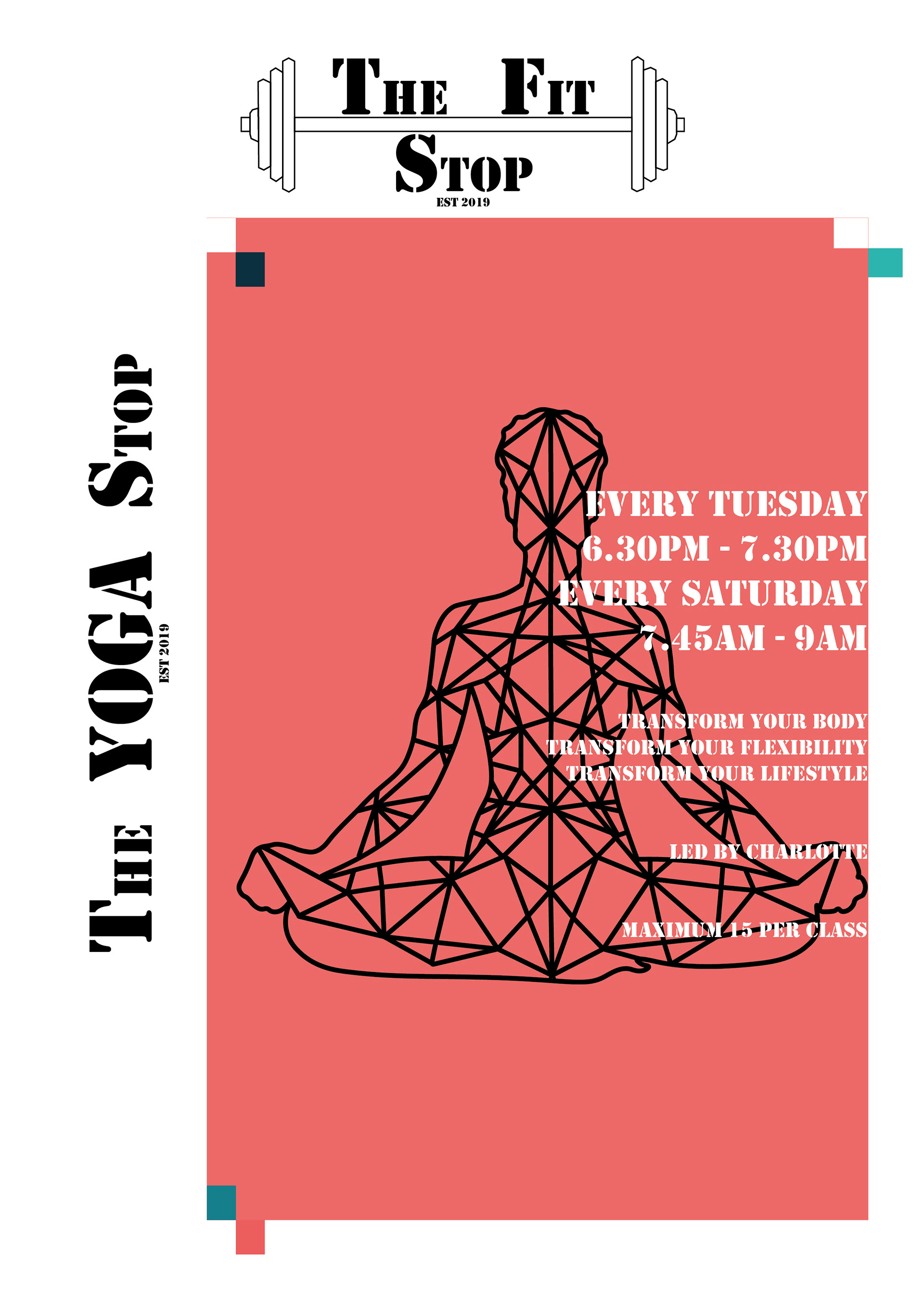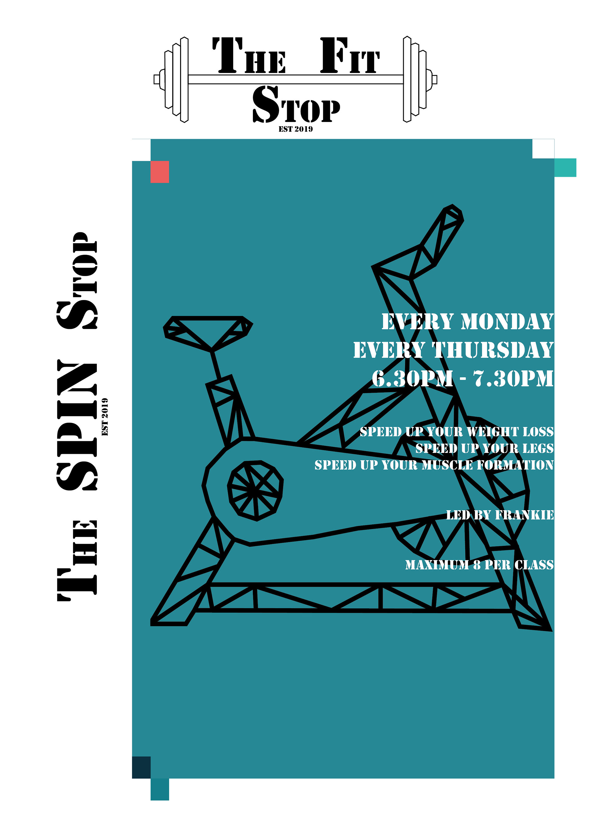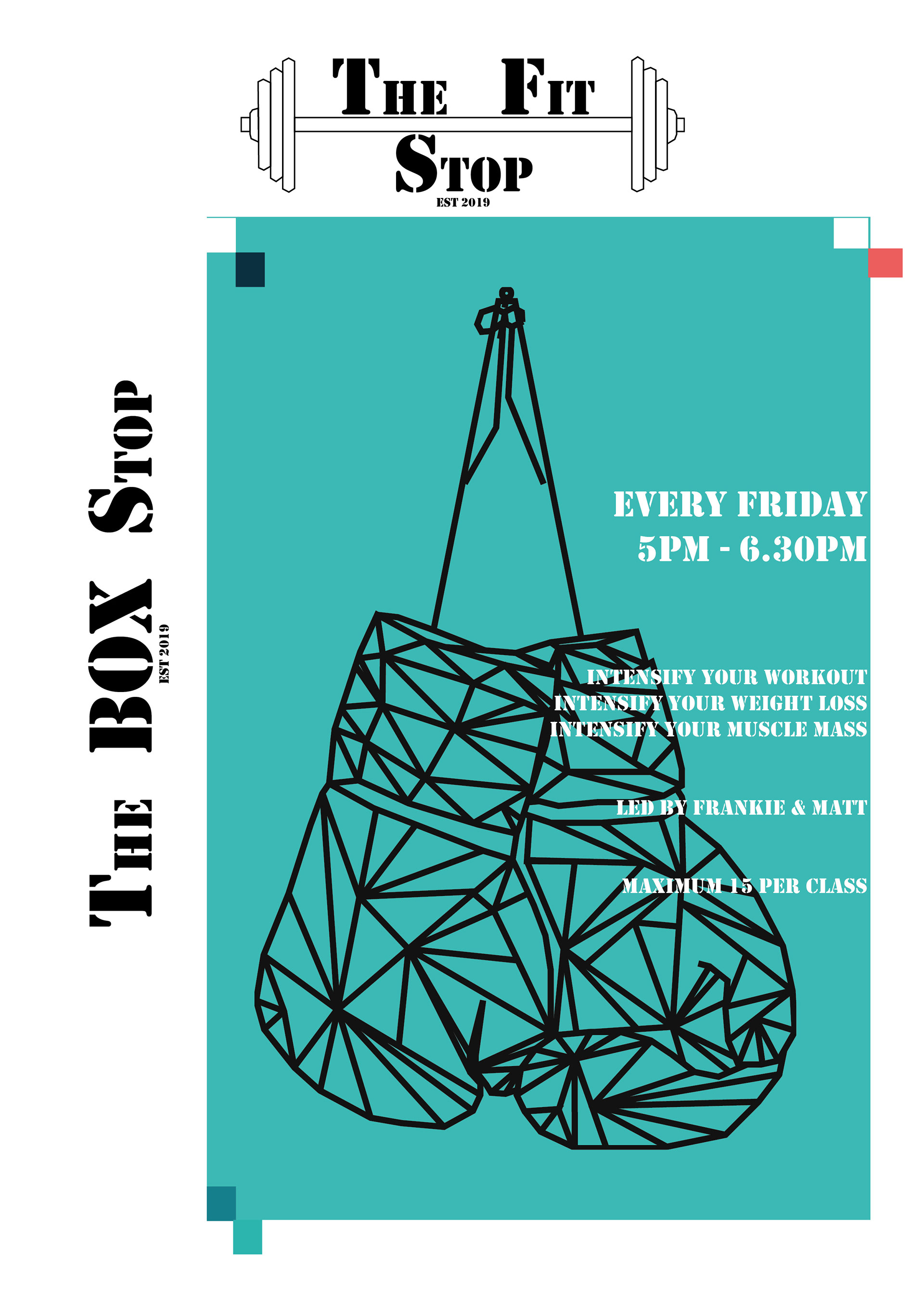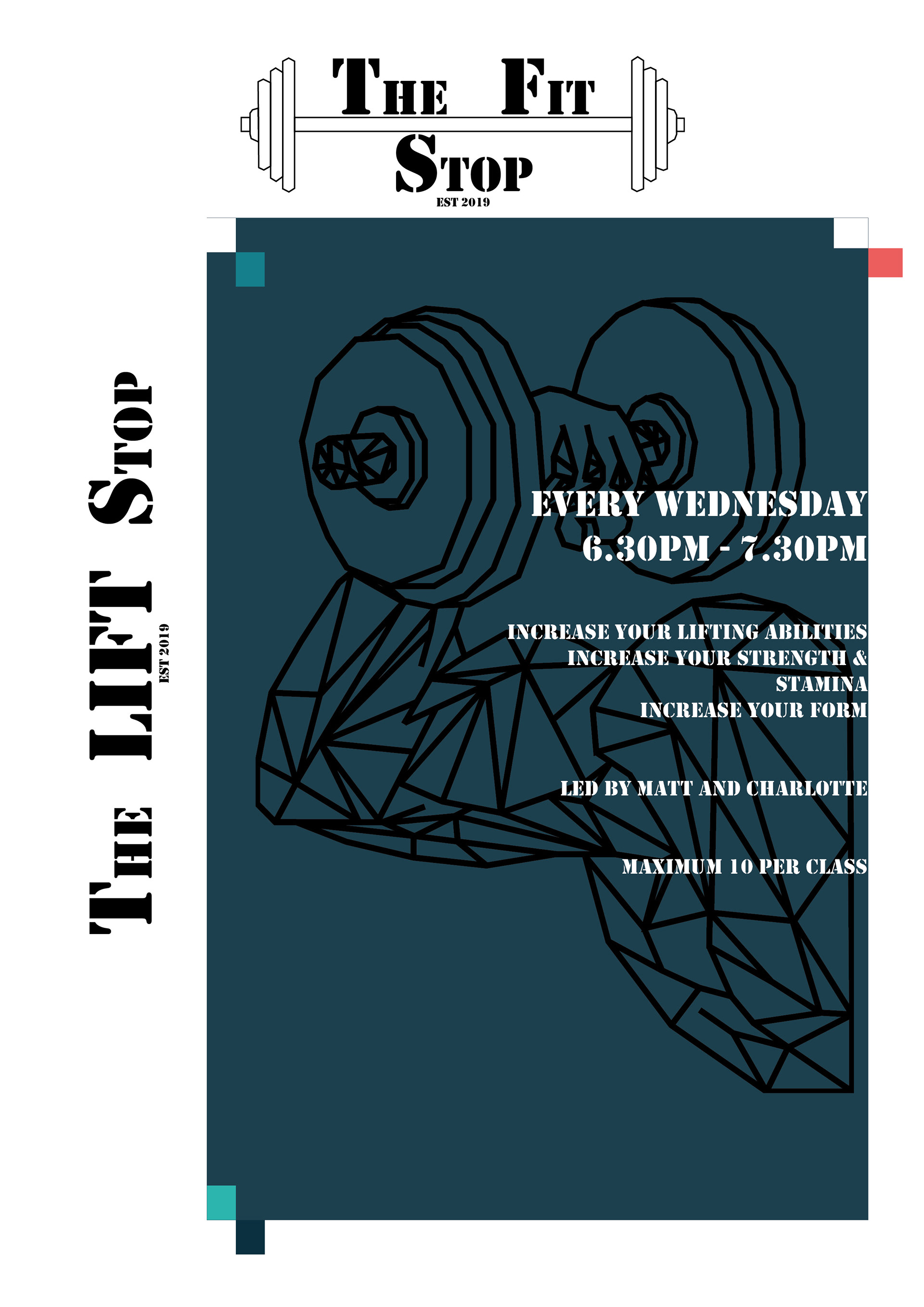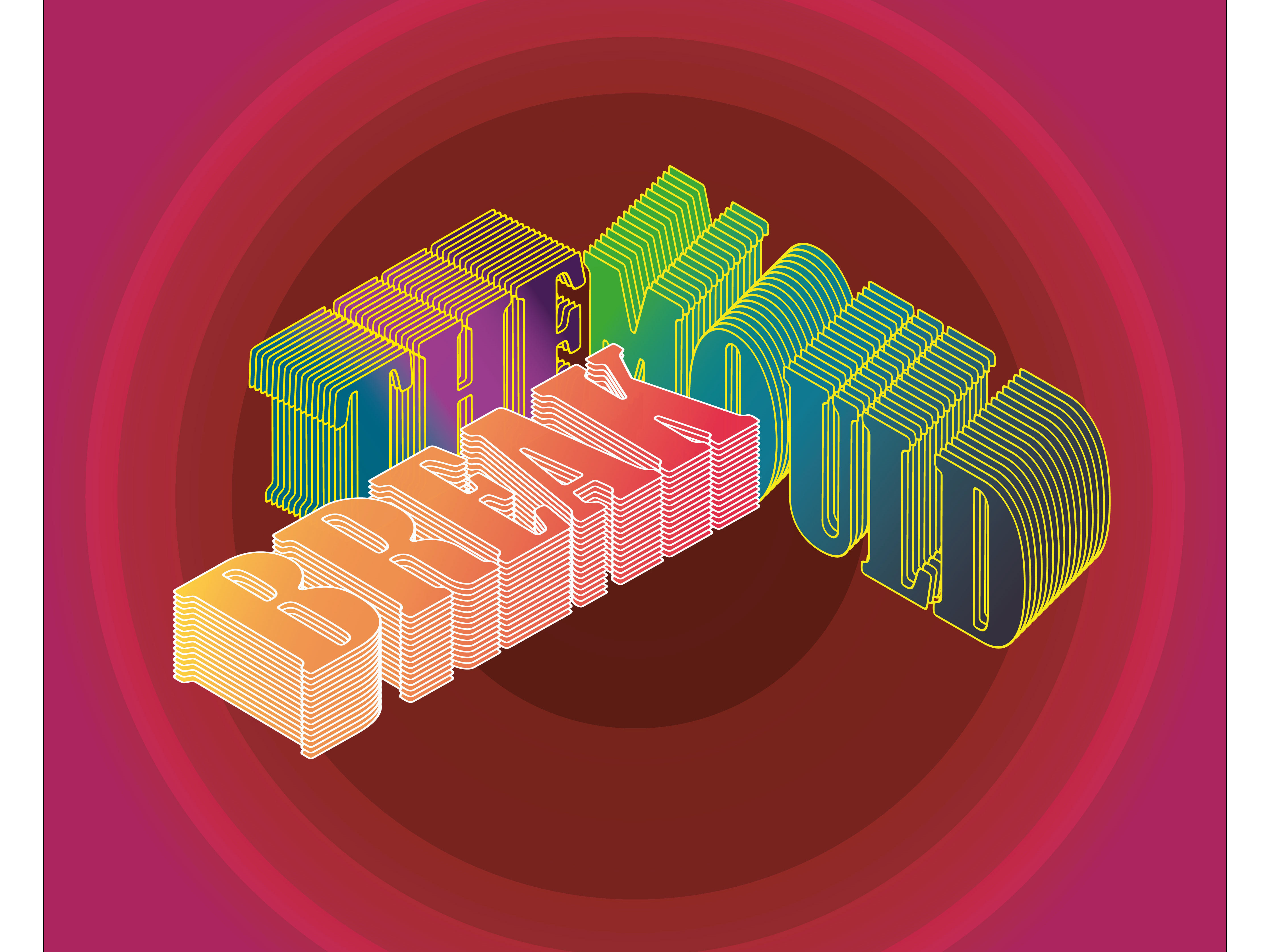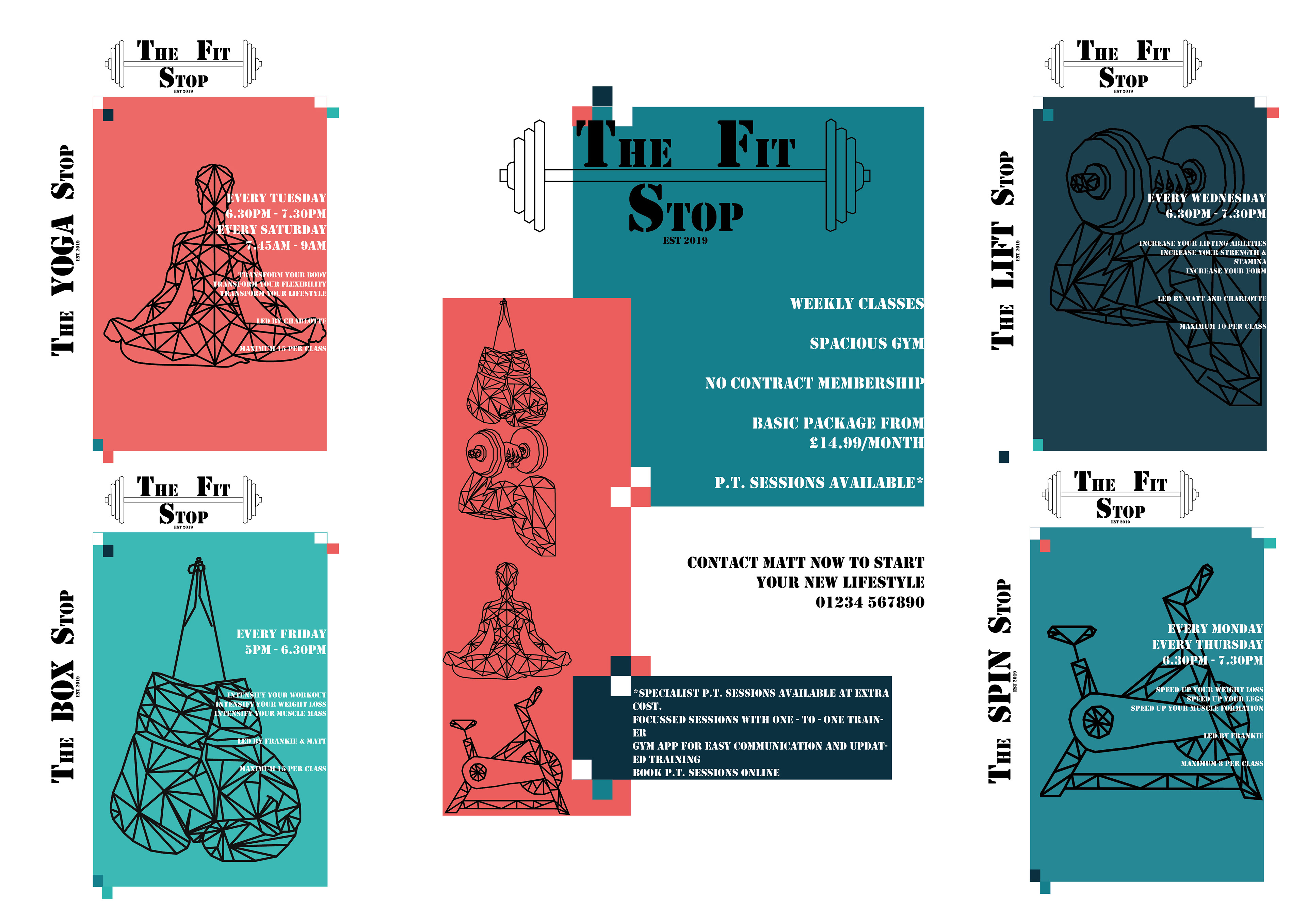
The Gym Branding
This was one of my favourite briefs - I have always felt gyms are either predominantly male oriented or female. It is sometimes difficult to find a gym that caters for all and offers classes for men, women and different abilities and needs.
With this brief, I was told to create a full gym branding package - to include posters for classes, recognisable logos, branding pieces that can be used through out the gym and a strong sense of communication.
I feel I achieved all of this with the work I have created - I spent a long time creating the geometric logos to produce an instantly recognisable picture for the gym members. The clear wording on the posters is also important to get across the necessary message.
I used 'stamping' font to represent the sense of hard work and energy needed. This is more often seen on army gear or clothing and so I felt this instantly recognisable font represented exactly what I want intending.
The colours were also important - I wanted softer colours, that were more muted against the harsher black font and logos.